Lisbon Tile Quilt

I’m super happy to have a quilt on the cover of Today’s Quilter after a long break!
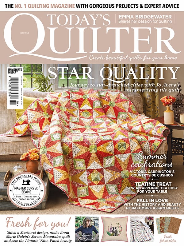
In fact it’s been a long time since I had a quilt project actually in the magazine. After spending the last few years designing their Block of the Month series and then working on my book I haven’t had much time to make one-off quilts for magazines. So I am extra excited that this one got on the cover AND for their 50th birthday issue, which is out today!

As the title suggests the inspiration for this quilt came from a holiday in Lisbon two years ago. I was amazed by the beautiful tiles that cover the buildings there. The patterns they make are fantastic quilt inspiration!


I first designed a version of this block for last year’s Aurifil Designer of the Month series. The theme of that year’s sampler quilt was ‘The Places We Go’ so a block inspired by my holiday fitted the bill perfectly. You can read more about it in this post.
I loved the kaleidoscopic effect I got when I put the blocks together in EQ7 and I really wanted to make that quilt! But I soon realised the block needed a bit of a re-design and a scaling upwards. Which is what I did for this quilt.


This is the actual block which is made up of 4 identical quarters, each one containing 14 pieces.
The whole thing is Foundation Paper Pieced and there are 100 of those quarter blocks in total. The photo on the right show what a stack of 100 blocks looks like!
I have to say that this quilt very nearly broke me!

I don’t want to put anyone off from actually making this, I would just suggest you pace yourself, rather then make it within 2 weeks because you have a deadline!


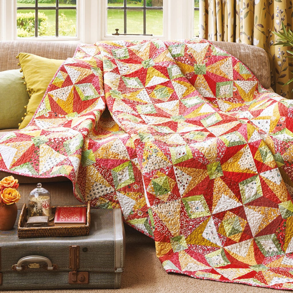
This quilt is also a little different for me due to quite a restricted colour palette.
Today’s Quilter is a more traditional quilting magazine, so the tone needed to be a little more subdued than my bright modern quilts.
However I love a pretty vintage print as much as a bold solid and I pulled almost all of these fabrics from my stash. Luckily we had recently taken delivery of new Liberty Craft Cottons at our Edinburgh store and I was able to use some of these too.
I chose cherry reds, pale mossy greens, ochre yellows and creams, all with ditsy small prints. It would actually make a really good scrappy quilt if you divided your scraps by colour first.


As it was such a busy quilt I chose a subtle cream Aurifil 50wt for the quilting and an overall pattern that I am finding it hard to think of a name for! It’s a sort of curvy tick surrounded by petals and it gave me the consistent overall texture I was looking for.
What I really wanted was to keep the kaleidoscopic effect that had so inspired me when I designed the first block and I hope I have achieved it here. The magazine described this quilt as mesmeric and I do find myself staring it at as different shapes and curves appear and disappear.
It definitely needs to be viewed from a distance to get the right effect. However close up it can still be enjoyed due to the wide range of pretty fabrics and the scrappy vibe they give.


It looks amazing, I really like the colour choices. I have to admit that I still haven’t braved foundation paper ripping. x
Seeing this made up is wonderful – this is a real
Keeper – you can be justly proud of this creation
This looks great, but a hundred paperpieced quarter blocks does really scare me a bit; perseverance does show!
Love the colours of your quilt. Admire your patience with the FPP blocks. It needs a psychological pep talk to approach that many but it is always worth it for the pristine lines of FPP .