Farmer’s Wife 1930s QAL – Crystal


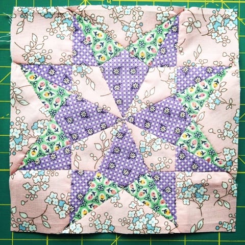
Crystal was made using fabrics I bought from Sew and Quilt’s beautiful stand at the Festival of Quilts in these lovely soft pinks and mauves.
Once I had committed to the QAL I ordered some vintage fabric for my own shop and since then my blocks have become much more ‘primary’ coloured, and Crystal seems to stand out a little from the crowd.
With this in mind I chose the mauve fabric again for Coral (above) which I completed last week. I absolutely love this block! It looks so modern against the others and has inspired all sorts of quilt ideas in my head!

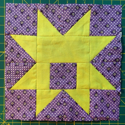
But then I went straight back to the primary colours for Carrie which I finished last night, (and I’m not sure about this one either – red’s too dark?). I know some people have planned their fabrics and colours ahead, but I find that sort of thing very hard to do and too restraining.
But will I regret this if they don’t all go together at the end? Let’s have a look at my completed blocks so far…(apologies for photo – taken in December gloom in Scotland!)

What do you think? Have I got two separate quilts here? I could put Crystal aside (and Coral too?) and carry on with the brighter palette (I can easily re-make Crystal later), or I could make more pink/mauve blocks in the future to balance things out. Or do they all look fine together?
I would love to hear your thoughts, and also is this a problem you are experiencing with your own Farmer’s Wife?
Meanwhile I have one more commission quilt to make and one more workshop to teach before I head off to Tenerife for a week’s holiday with my sister. Jane is also doing the FW1930sQAL so we are planning a ‘blockathon’ in the sun!!
It is looking so gorgeous, all my favourite colours. In my honest (and very humble) opinion, I think the two purple ladies are the start of another quilt which will be just as beautiful in its own right.
Your blocks are lovely Jo. I think it is early enough to incorporate both colours into the finished quilt. The purple in the top right has the same hue as the pink fabric in the middle of the third row. I believe you could mix both and when you look at the book Laurie Hird has used all sorts of fabrics. It is the sashing that will make the difference. A white sashing will make everything pop – a coloured sashing will tone down everything.
I am trying to add a touch of balance by sashing my blocks as I go so I lay the quilt out before adding another block. I have pastels and brights mixed in together. Some blocks are brash and bold and others are pastel and pretty. It seems to be working – at least to my eye.
Having said all that (yes, my comment is turning into an essay!!) you could leave Crystal and Coral out of the equation and go with your primaries. You may not need all the blocks depending upon the size of quilt you are making.
Hard decisions but I need a lie down after all this typing. Perhaps I can stow-away on your holiday and lie in the sun whilst you enjoy your sister's company. Have a great time.
xxx
They're all gorgeous blocks! I'd carry on for the time being – when I made my hexy quilt I didn't have a plan (for colours or block designs) but would lay them all out every ten hexies or so, just to get a feel for where I was heading and what I needed to do more/less of in the next ten hexies. If, after a few more blocks, Crystal and Coral are still bothering you, take them out of the line up and take another photo to see how things look. You can always remake them towards the end, if you wish…
Have a lovely holiday!
I see NO problems at all and like above comments…just start adding the purples with the others in future blocks.
Seeing them individually I wasn't sure, but all together they look really happy and vibrant! Stick with what you're doing , I think it's fab!!!!